by Luca Fiore
When, in 1982—forty-three years ago—the fifth expanded edition of The History of Photography by Beaumont Newhall was published, Stephen Shore was thirty-five. It’s a super-classic, still studied today in universities all over the world—or almost. His name and one of his photographs appear on the very last page of the volume, alongside those of William Eggleston and Joel Meyerowitz, cited as pioneers of the new color photography. After all, his first solo exhibition had been at the Metropolitan Museum of Art in New York in 1971, when he was just twenty-three. A lot of time has passed since then. What must it be like to live for four decades knowing you’ve already made history?
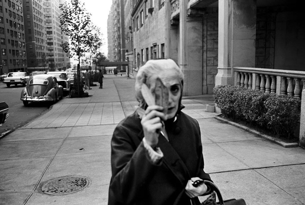
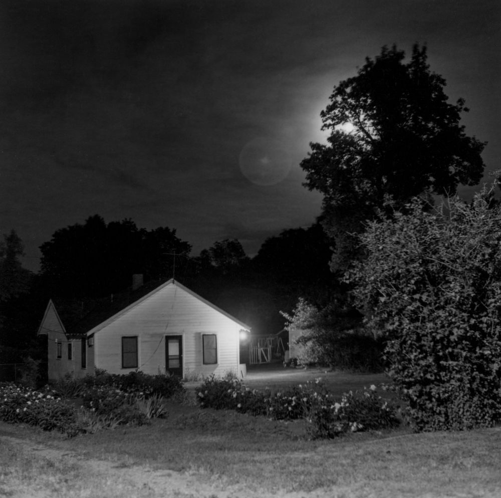
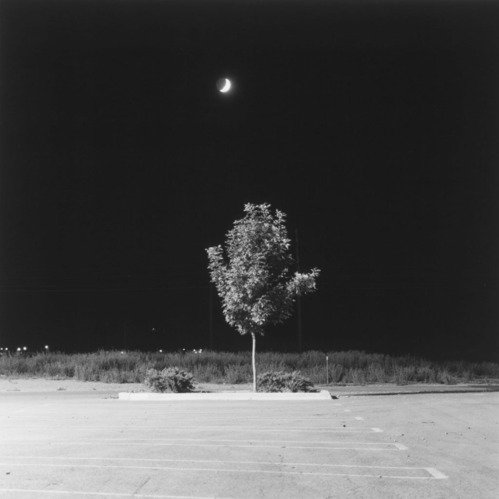
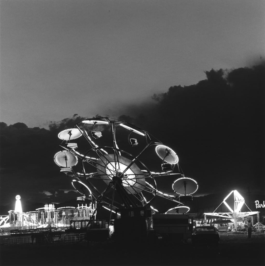
In truth, photography is neither football nor pop music, and fame is a relative concept. And it took quite some time before he was actually considered “famous.” Shore tells Il Foglio that for the first twenty-five years of his teaching at the photography program at Bard College—which he still directs—he never showed his own work, not wanting to produce imitators: “I only started showing it when it had become so well known that it no longer made sense not to.” He’s referring mainly to the images in his most famous book, Uncommon Places, published in 1982. Urban and everyday landscapes, portraits made with the precision of a large-format camera—and in color. Before him, no one had done it quite that way. His other cornerstone contribution to the tough soil of photographic history is American Surfaces, the record of a journey from New York to Arizona, where the black-and-white Americas of Walker Evans and Robert Frank blend into a cocktail of vernacular visions: motel rooms, diner tables, armchairs, and carpets in quintessentially American hues.
Shore was the favorite photographer of Peter Schjeldahl, the erudite and exquisitely refined art critic of The New Yorker, who passed away in 2022. Schjeldahl wrote of him: “The closest to Shore, in a cohort that includes Joel Meyerowitz, Joel Sternfeld, and Richard Misrach, is his friend William Eggleston, the raffish Southern aristocrat who has made pictures unbeatably intense and iconic: epiphanies triggered by the hues and textures of a stranded tricycle, say, or of a faded billboard in a scrubby field. While similarly alert to offbeat sublimities, Shore is a New Yorker more receptive than marauding in attitude. I fancy that Eggleston is the cavalier Mephistopheles of American color photography, and Shore the discreet angel Gabriel.”
Until recently, the only colorful detail in his biography was that, at just seventeen, in 1965, he found himself photographing at Andy Warhol’s court—an experience that lasted five years and was later gathered in Factory: Andy Warhol (Phaidon, 2016). That seemed like plenty. And yet, this year he has come out with a brand-new book, Early Work 1960–1965 (MACK, 2025). Here again, the dates matter: these are photographs made between the ages of twelve and seventeen. They are the shots of a teenager, yet they look like the work of a fully formed artist. The volume is accompanied by a text in which Shore recounts how those images came to be and tries to reconstruct the atmosphere of New York in those years—even though he admits, “It’s like looking at someone else’s work. I actually have no memories; I can’t recall what I was thinking or what drove me then.”
He tells of a child who, for his sixth birthday, received a Kodak ABC Darkroom Outfit, a kit for black-and-white developing and printing. At eight he had his first camera, a Ricoh 35. At ten, his first copy of American Photographs by Walker Evans—the first encounter with art photography. At twelve, he was already active: “I used to go to a small playground on 57th Street and the East River, just outside Sutton Place, a well-to-do neighborhood. I photographed kids who were there with their nannies. I’d ask for their addresses, make a 20×15 cm print, and show up at their parents’ apartment with the photo. I asked for five dollars—which would be fifty today. No one ever refused.”
In 1962 he met a photojournalist, Lee Lockwood, who took him under his wing and introduced him to the New York photography world. Lockwood was editor of a quarterly magazine, Contemporary Photographer. Leafing through it, Shore saw for the first time the work of Lee Friedlander, Don Donaghy, Duane Michals, Bruce Davidson, and Dave Heath. He became friends with Heath, who introduced him to W. Eugene Smith, the legendary Life photojournalist. One day the young Shore asked Smith how much one of his prints cost. Smith replied, “Thirty-five dollars.” The boy said, “Thirty-five for a photograph?!” And the legend answered, “Okay, twenty-five.” A few months later Smith handed Shore the print—it was Guardia Civil, from his photo-essay Spanish Village, published in Life in 1951.
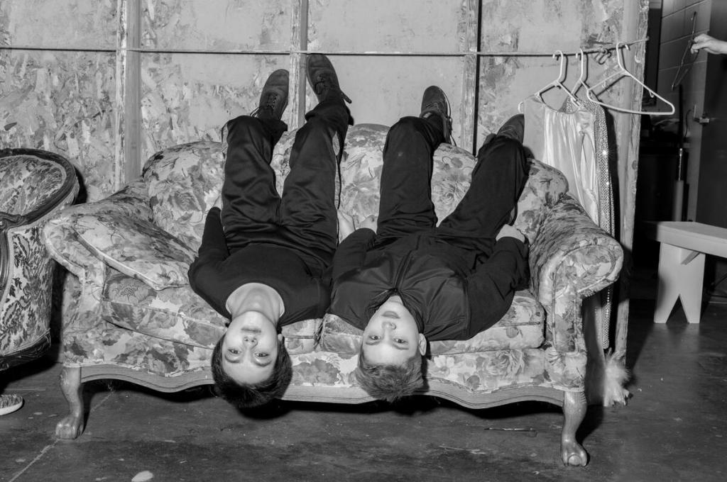
In the spring of 1962, at fifteen, Shore picked up the phone and called the Museum of Modern Art, asking for an appointment with Edward Steichen, then head of the photography department. Steichen not only agreed to meet him but bought three prints for the museum’s collection. Shore recalls: “Looking back on that period, I see that occasionally, when I wanted to meet someone I admired, I would just call them or show up at their door—as I did with the musician Noah Greenberg, and later with the experimental filmmaker Jonas Mekas.” The latter ran the Film-Maker’s Cinematheque, where Shore had the chance to screen one of his short films, titled Elevator. It was 1965, and that same night the premiere of Warhol’s The Life of Juanita Castro was scheduled. It was there that Stephen met Andy—the Pope of Pop—who invited him the next day to take some pictures at the Factory. Early Work ends with seven photographs taken on that occasion. Andy is there, of course, along with Ed Hood, Ann Reynolds, Donald Lyons, and Edie Sedgwick at her radiant best. Shore was seventeen but already a fully fledged photographer—he just had to apply what he had learned on the streets of New York. He kept returning to 231 East 47th Street almost every day for the next three years. Then, at some point, he left: “I didn’t want to spend my whole life in Warhol’s shadow.”
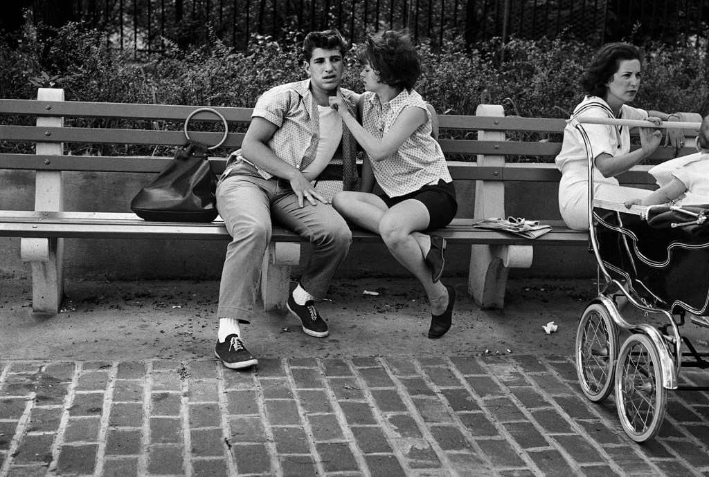
When asked why he decided to publish his teenage images, Shore explains that his assistant, Laura Steele—who manages his archive—had started working on those early negatives a few years ago. “You need to look at your old photos,” she kept telling him. One day, returning home from some errands with his wife Ginger in Rhinebeck, a small town on the Hudson near where he now lives, he decided to look through the stack of prints Laura had made. “On top was an image taken in ’63 or ’64 at a street intersection I had just driven through. I didn’t remember ever being there. And yet, the two people in the photo were my parents.” The coincidence struck him—but not only that. “It was as if, in that image, there were already the photographic concerns I would develop a decade later in Uncommon Places: the attention to the vantage point, the way shadows enter the frame from below, the relationship between poles and street signs. Everything was already there—and yet I had no memory of taking that picture.” That very image now appears on the back cover of Early Work. It feels like a prefiguration of the Shore to come. The rest of the book consists mainly of street portraits—men, women, old people, and children populating the urban landscape of New York. It’s a genre that flourished in the 1960s and made great names of Garry Winogrand, Joel Meyerowitz, and Diane Arbus. It’s as if, in those same years, you could hear a kid playing trumpet with the cadence and atmosphere of Miles Davis’s Kind of Blue.
But like Davis, Shore didn’t stop there; he has always sought to evolve his language. In his memoir Modern Instances: The Craft of Photography (MACK, 2022), he recalls the time, in 1976, when he met Ansel Adams—one of the fathers of American photography—at a mutual friend’s house. “During dinner I saw him drink six tall glasses of straight vodka. Toward the end of the evening he said to me: ‘I had a period of great creativity in the 1940s, and since then I’ve done nothing but mediocre work.’ I don’t remember the context of the remark, but I remember clearly that he said it in a dry tone, like a photographer observing something.” That sentence, Shore says, stuck in him like an arrow. He vowed never to end up saying the same of himself. Of course, there are great artists who have always remained faithful to their language without losing their edge—he thinks of Eugène Atget, Bernd and Hilla Becher, and Lee Friedlander. “Others renewed themselves by changing their aesthetic approach or subject matter—sometimes simply by changing cameras. During that dinner with Adams, I realized that, temperamentally, I belonged to the second group, the ones who refresh their vision.”
Over the years, the different cameras Shore has used have indeed changed his language. At the beginning there was the large-format view camera with color sheet film (20×25 cm), but later came the cellphone, drones, and digital medium format (for the gear-obsessed: a Hasselblad X1D). Each technology imposes limits and opens new possibilities—the photographer’s body and mind assume a different posture depending on the tool being used.
That lesson from Ansel Adams is one of many that Shore tries to pass on to his students—who arrive at Bard College at the same age he was when he entered the Factory. And even if his images seem, visually, to have little to do with the Warholian world, the link between Shore and Andy runs deep. “From him I learned first and foremost how an artist works. I saw him at work and saw how he experimented—trying and trying again—to understand what worked and what didn’t.” But there’s more: “In him there was what I call a distanced delight in contemporary culture. A kind of detached pleasure, in the sense that he would see something and say, ‘Wow, look at that.’ And he didn’t just mean he liked how it looked—he was amazed that it existed, and that it existed that way. Yet he maintained a distance, which wasn’t necessarily critical detachment. He liked everything, but always with a measure of distance. And that’s perhaps an attitude that, in some way, belongs to me too—especially in my American Surfaces images.” A title, incidentally, that Andy would have loved.
And what about his nineteen-year-old students? What should they be taught? “My task is to help them find their own voice,” Shore explains. “That’s why, along with technical instruction, we give a lot of space to class discussions of their work. Technique must always serve expression and aesthetics.” But there’s also something else, perhaps even more interesting: “Bard is a liberal-arts college, so students majoring in photography are required to take courses in the humanities or sciences—but the opposite also happens: in my classes I sometimes have students who have no intention of becoming artists, but study sociology or history. And I think that’s very interesting, because then my job is to teach them to look attentively. They walk every day from their dorm to the classroom, usually with headphones on or eyes on their phone. But if they take that same route with a camera around their neck, they begin to notice things they’d never seen before. Paying attention is a very useful skill for anyone. And it’s perhaps the most important contribution photography can make.”